Punchcard-ish Graph from Google Analytics Data

The other day I wanted to see when users are actually using my website. The most obvious way (to me) is to have a github-like punchcard graph. My alternatives were to either write a program or use Excel. To cut a long story short, I chose to use Excel.
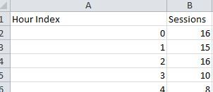
If you have enough users, Google is enabling hourly analytics for your site. Otherwise, you need to be content with daily analytics. You can export your data from Google Analytics in CSV format. The export will give you a hour index and a number of sessions in that hour:

To this I've added a column representing the hour of day (HoD) which is a simple MODULO operation of the Hour index (=MOD(A2,24) + 1). I've also added a Day field as column D =INT(A2/24) and a "Day of week" column E =MOD(D2,7) +1:

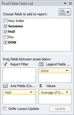
Following this tutorial step I created a pivot table with the following characteristics:

Note the values as the Average of Sessions column (not sum, as it is by default).
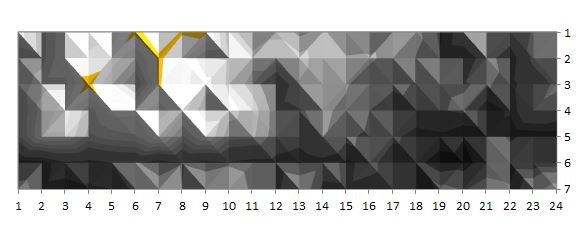
Now, we can create a Contour table (in the Surface category) in Excel off the pivot chart (which is basically a heat map, or a top view of a 3D plot). I got something like:

Which basically tells me that I've got a blog people use for work (most hits are on week days) and my audience is in the US and India :) (the hours of usage).
Notes:
- You can change the plot resolution with this tutorial to suit your numbers. I had to do it because it would partition only in 3 layers for me.
- You can change the palette to something relevant (like a heat map), but you need to do it by hand (I could not find an automatic way to create a gradient.
HTH,

